


.png)

1. Users need a clear icon to represent a date.
2. Info wasn’t present so users need a better cue.
3. Users assumed confirmation; users need a clear explanation.
1. Users need a clear icon to represent a date.
2. Info wasn’t present so users need a better cue.
3. Some styles didn't pop out so easy for users or were hard to get to.
.png)
.png)

.png)
1. We tried to use contrasting colors. Also attempting to be careful with over usage of colors.
2. We considered the interactions in the prototype and made sure they were no more than 5 seconds.
3. We also made a menu to be able to help navigate in other ways.
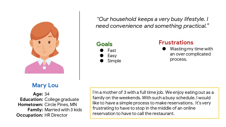
This app will allow customers to make easy reservations for Honolulu Restaurant.
I learned that people think differently than I do. The first design was only the beginning of my thought process but with usability study and feedback. I was able to discover more design influence.
1. Conduct another usability study to see if there are any other pain points.
2. Conduct more research for better user experience.
If you like what you see and want to work together, get in touch!
info@jvtdesignstudios.com